Beartai
This is a website redesign project with the following core requirements from stakeholders and the Beartai team:
- Design: Modern, user-friendly, simple, and uncluttered.
- Experience: A content feed with infinity scroll.
- Functionality: Retain the existing back-end system's ability to add flexible content modules.
- Performance: Significantly increase the website's loading speed.
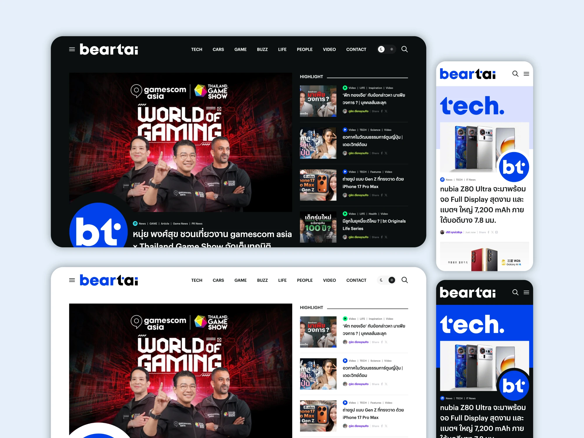
My Focus and User Persona
After the Beartai team defined the goals for the redesign project, I became responsible for the design and user experience, which includes:
- Design: Modern, user-friendly, simple, and uncluttered.
- User Experience: A content feed with infinity scroll.
Users Persona
The Beartai team defined their target users as follows:
- Primary Audience: ~65% male, with a strong interest in technology, smartphones, and gadgets.
- Secondary Audience: Individuals interested in entertainment, especially international movies and series from the "Beartai Buzz" section.
- New expansion targets: young, urban professionals in Bangkok with a middle-to-high income.
After receiving the user data, I defined the personas and recruited users to identify and recheck the pain points of the old website.
Bias
Finding users who matched our persona was challenging due to budget and other constraints. Additionally, in my role as the designer, I didn't advocate strongly enough to establish a formal system for interviews or testing. Consequently, testing was conducted only internally with team members who fit the persona. This may have introduced bias into the interviews and tests, as the participants were already stakeholders in the project.
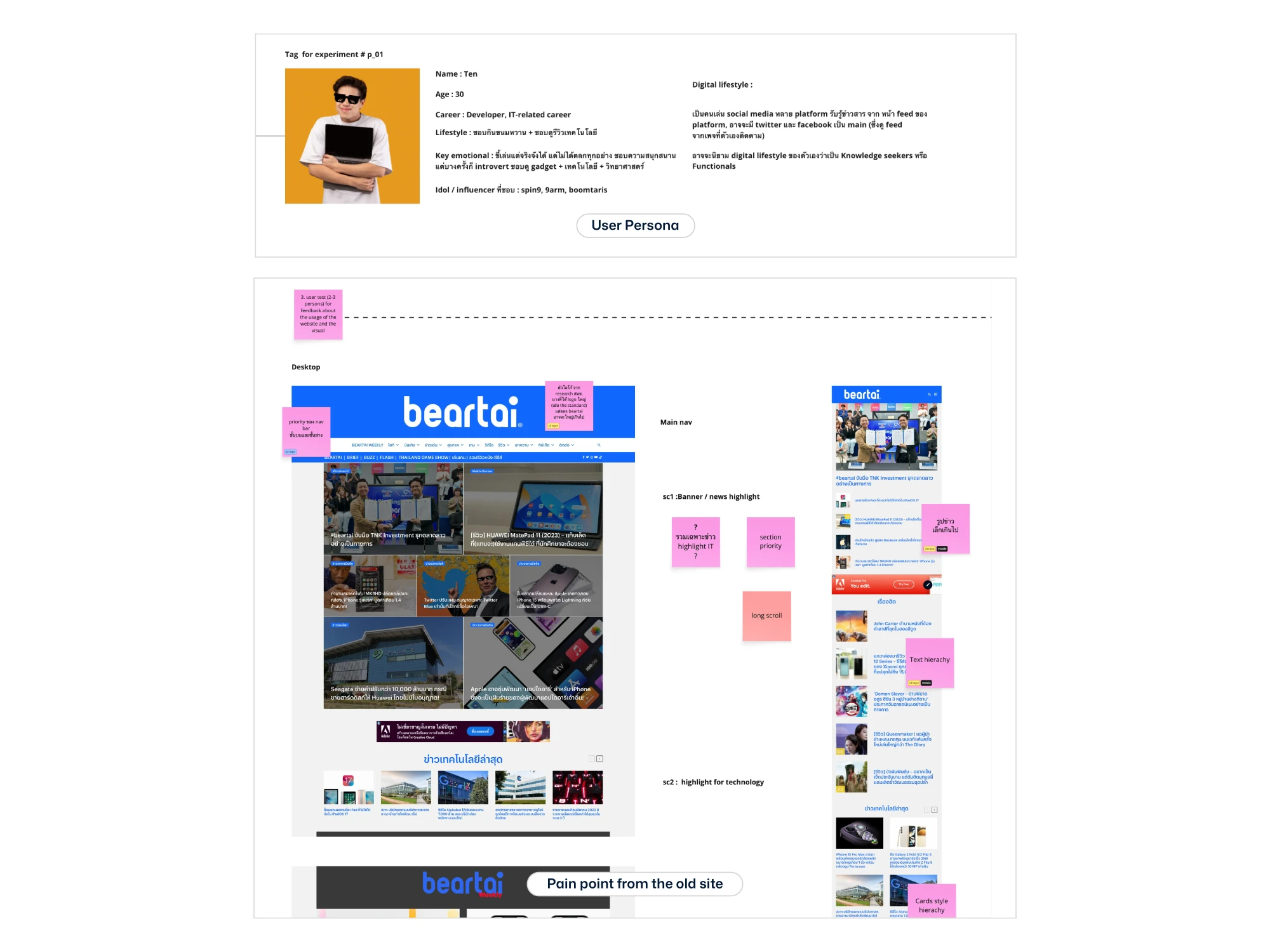
Define
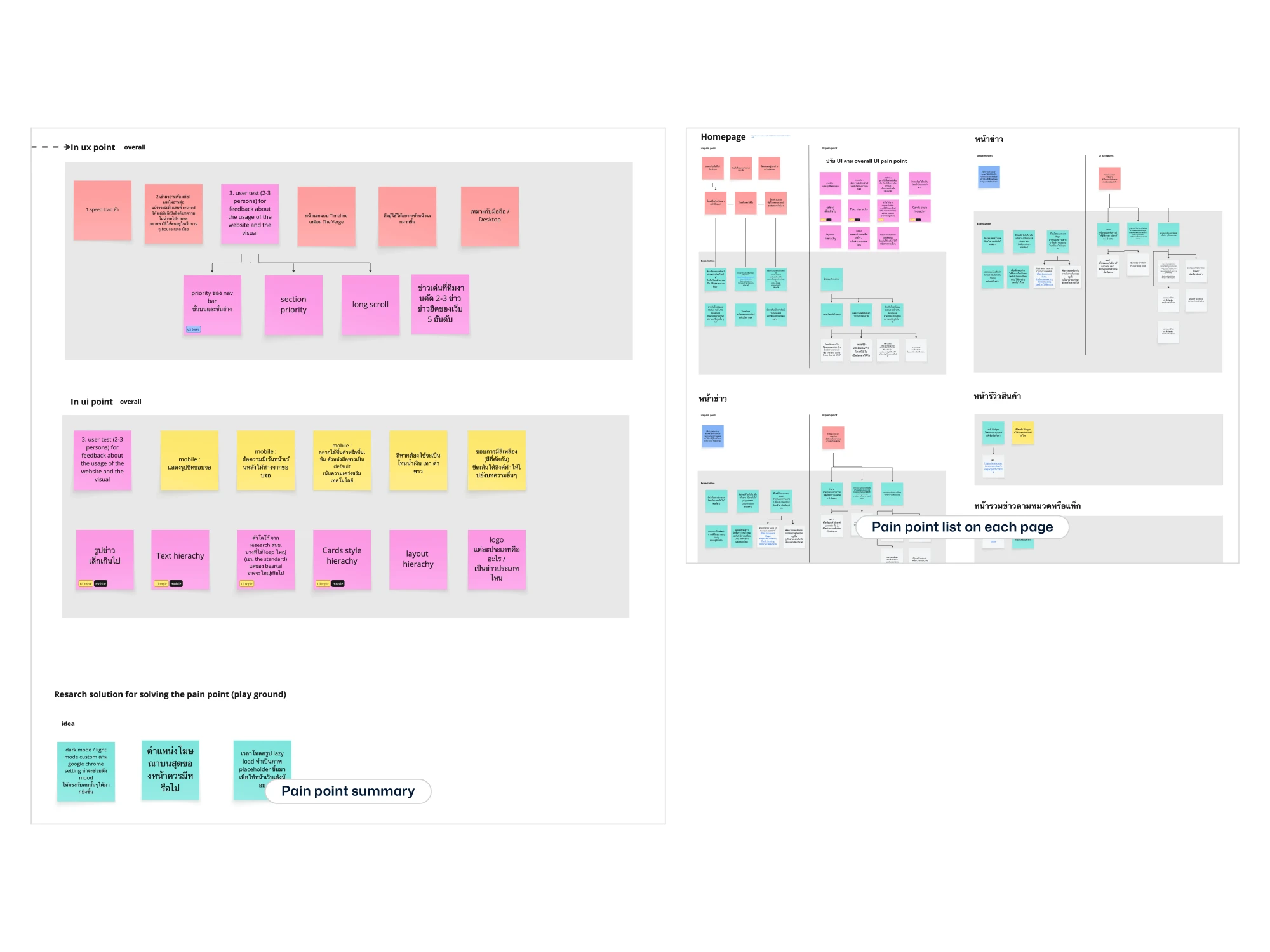
During the usability test, participants were instructed to identify their pain points when using the current version of the website. Afterwards, they wrote each point on a Post-it note, which we then used for affinity mapping and categorization.
I used the feedback from the Post-it note exercise to create an affinity map, separating the problems into UX and UI categories. The design phase will now focus on solving these specific issues.
Light and dark mode
In addition to improving the website based on the grouped pain points, I also proposed implementing dark and light modes for two main reasons:
- The Beartai team wanted the website to have a predominantly dark theme because they feel it looks more serious and fits the technology context.
- However, considering the user data, while the majority of users are male, there is still a significant percentage of female users, some of whom may not always prefer a dark background.
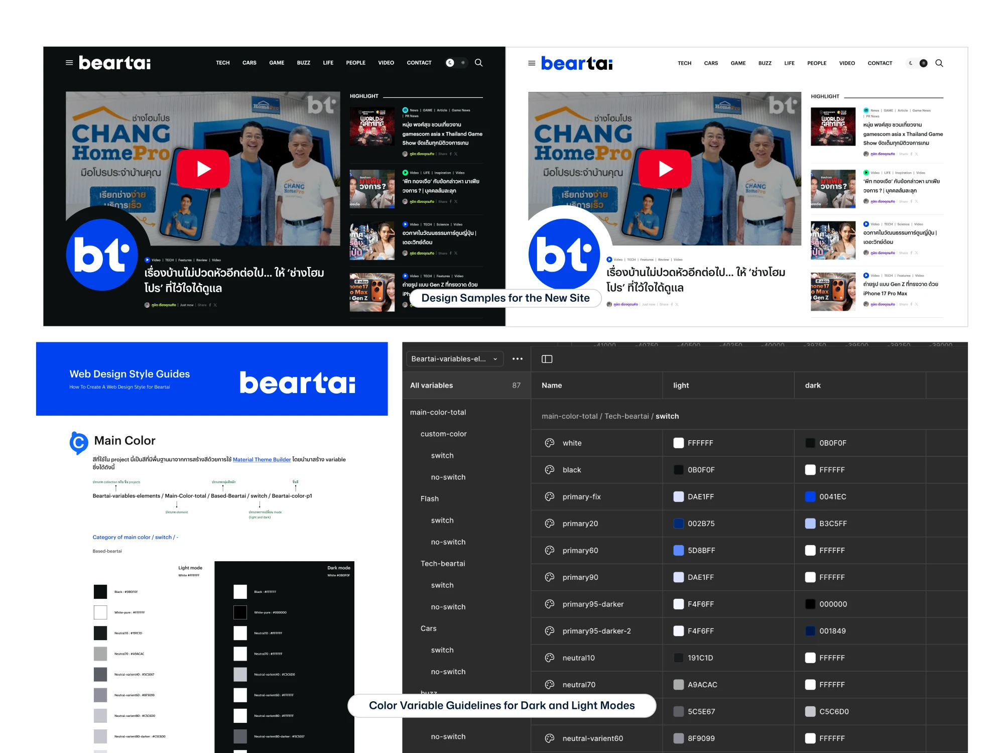
Hand-off for the developer
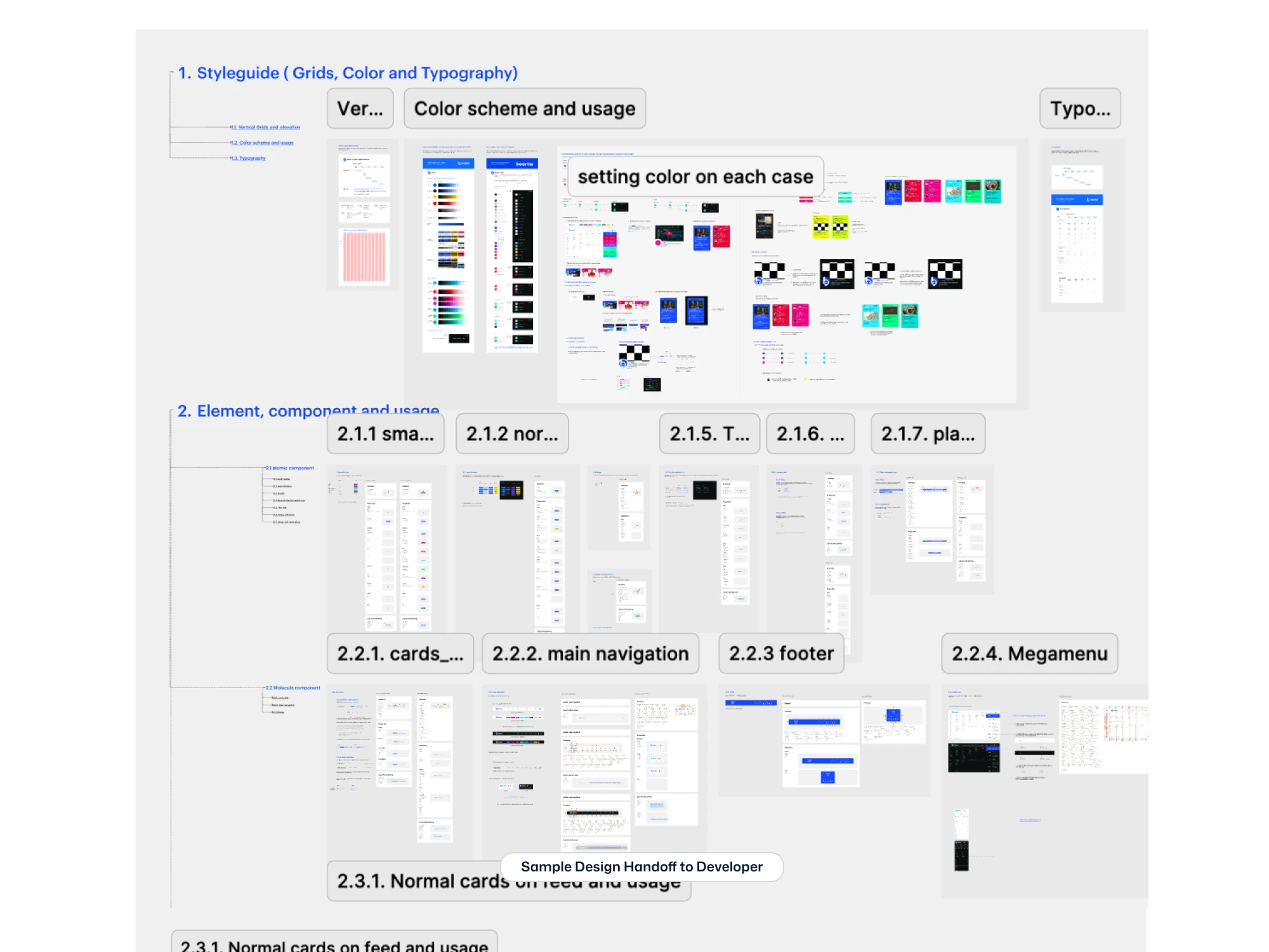
When working with a complex color system, the handoff process and communication with the development team are critical. To ensure a smooth implementation, I prepared a comprehensive handoff guide that specifies color usage for different cases. This was designed to enable developers to work more efficiently and systematically.
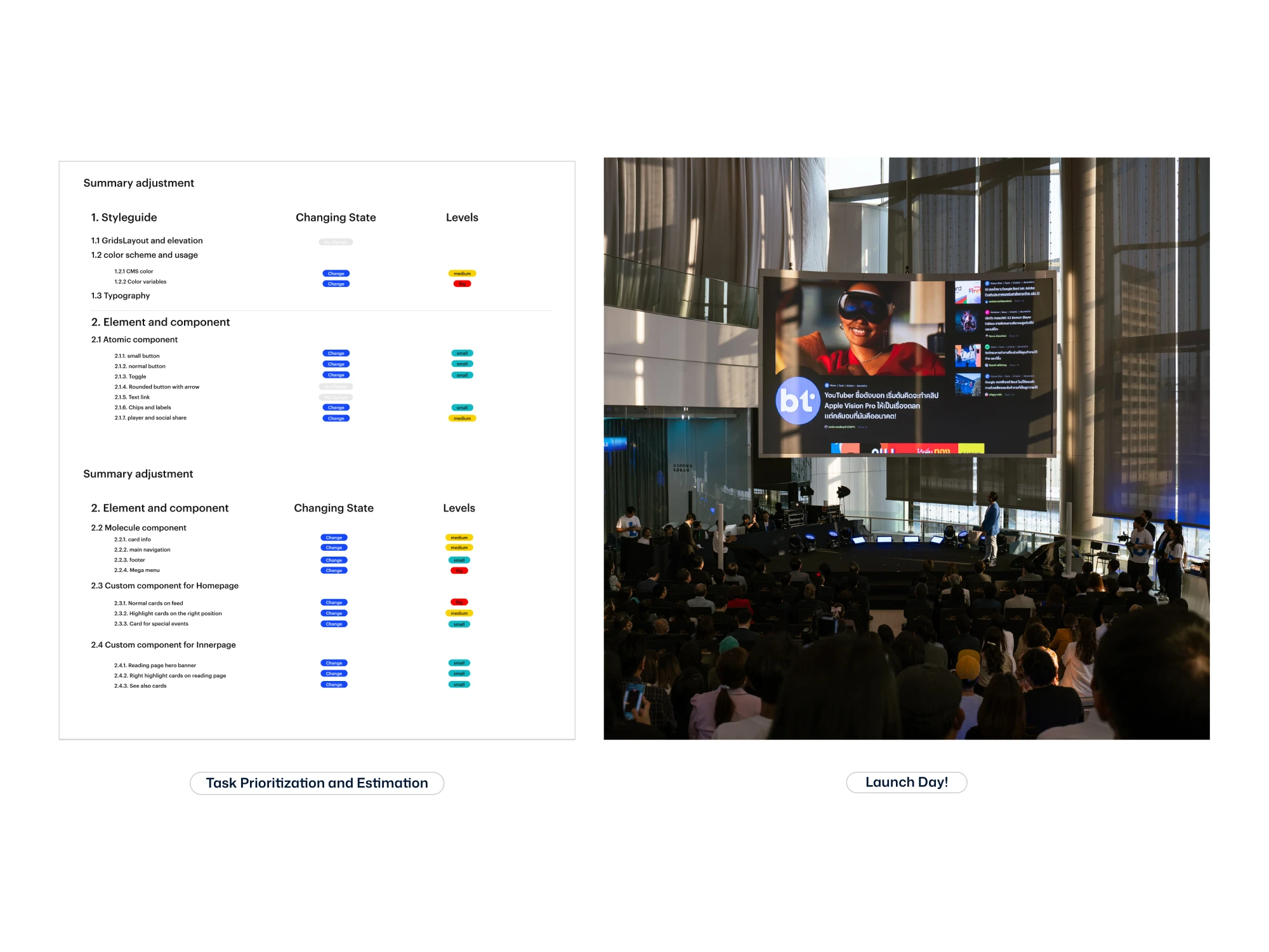
New Website Launch
The new Beartai website launched on March 1, 2024. Prior to this, the company underwent a rebranding and updated its Corporate Identity (CI). This created a two-month timeline to evaluate and align the website with the new CI. I assessed the situation and prioritized the necessary adjustments, as shown in the sample table on the right. Despite the tight schedule, the CI updates were completed on time, allowing the Beartai team to launch the new website and the new CI simultaneously as planned.